If you’ve developed with the Salesforce Lightning Framework, you’re probably familiar with the Lightning components available in the UI namespace. They include ui:button and ui:inputText among others. These out-of-the-box components are intended to get you up and running quickly, but the reality is they’re pretty buggy. It can take some tweaking to get them to look right.
Issues with ui:inputDateTime
A prime example of this is ui:inputDateTime. If you use it in conjunction with the SLDS classes slds-input and slds-form-element__label, the component’s layout gets out of whack.
<div class="slds-form-element__control">
    <ui:inputDateTime aura:id="startdate" label="Start"
                      class="slds-input"
                      labelClass="slds-form-element__label"
                      value="{!v.StartDateTime__c}"
                      displayDatePicker="true" />
</div>
The slds-input class forces a width of 100% on the input textboxes which pushes the calendar icons to the next line.
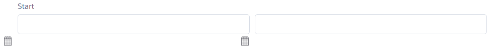
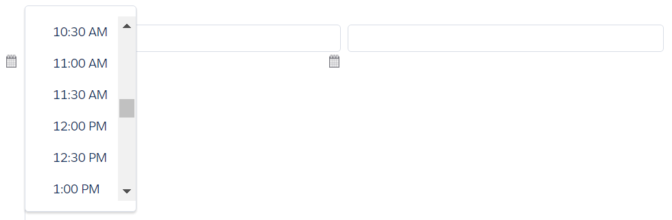
Even worse, when you click the icon for the time selection, the list doesn’t appear under the textbox like it should. Instead it is positioned to the far left.
The fixes turn out to be straightforward, but there are many annoyances with these components. You’ll find yourself tweaking them to get the look just right.
Component Inheritance
An approach I’ve been using is to wrap the built-in components using component inheritance. To fix the calendar icons, I extended ui:inputDateTime and included custom CSS to position the icons and the time list. I also included the SLDS classes as defaults. This is a nice way to encapsulate tweaks for the built-in components and make them much easier to use.
inputDateTimeCustom.cmp
<aura:component extends="ui:inputDateTime">
	<!-- Provide SLDS default classes for the input and label.  -->
	<aura:attribute name="class" type="String" default="slds-input" />
	<aura:attribute name="labelClass" type="String" default="slds-form-element__label" />
	<aura:attribute name="displayDatePicker" type="Boolean" default="true" />
</aura:component>
inputDateTimeCustom.css
.THIS .dateTime-inputDate {
	position: relative;
}

.THIS .datePicker-openIcon {
	position: absolute;
	left: auto;  /* IE doesn't support initial so use auto instead. */
	left: initial; /* Reset the left value so it doesn't interfere with the right. */
	top: 7px;
	right: 13px;
}

.THIS .dateTime-inputTime {
	position: relative;
}

.THIS .timePicker-openIcon {
	position: absolute;
	left: auto;  /* IE doesn't support initial so use auto instead. */
	left: initial; /* Reset the left value so it doesn't interfere with the right. */
	top: 7px;
	right: 13px;
}

/* Fix the position of the time picker. */
.THIS .uiInputTimePicker {
	top: 100%;
	left: 51%;
}

/* Pointer cursor instead of text selector for the time list items. */
.THIS .datepicker--time__list li {
	cursor: pointer;
}
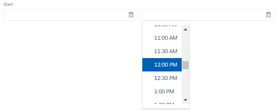
Using the new component gives you the fixes for free, and the default SLDS classes simplifies the markup.
<div class="slds-form-element">
    <c:inputDateTimeCustom aura:id="startdate" label="Start"
                           value="{!v.StartDateTime__c}" />
</div>
Ahhh. Much better!
The Lightning Namespace
In the Winter ‘17 release, Salesforce introduced a new namespace called lightning. It includes a number of components designed to integrate better with the look and feel of the Lightning experience. I don’t know for sure, but my sense is they will eventually supersede the components in the UI namespace. Hopefully, they will provide a better out-of-the-box experience.